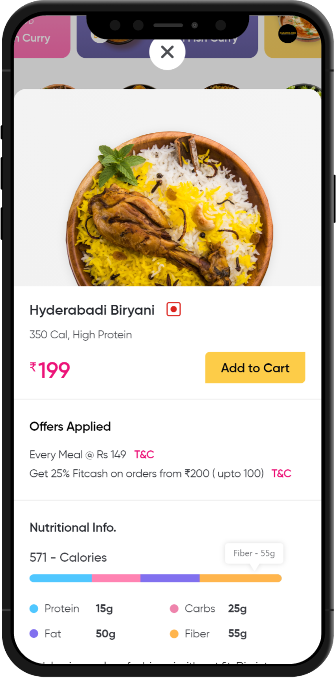
Achieve Your Fitness Goal by Eating the Tastiest Food
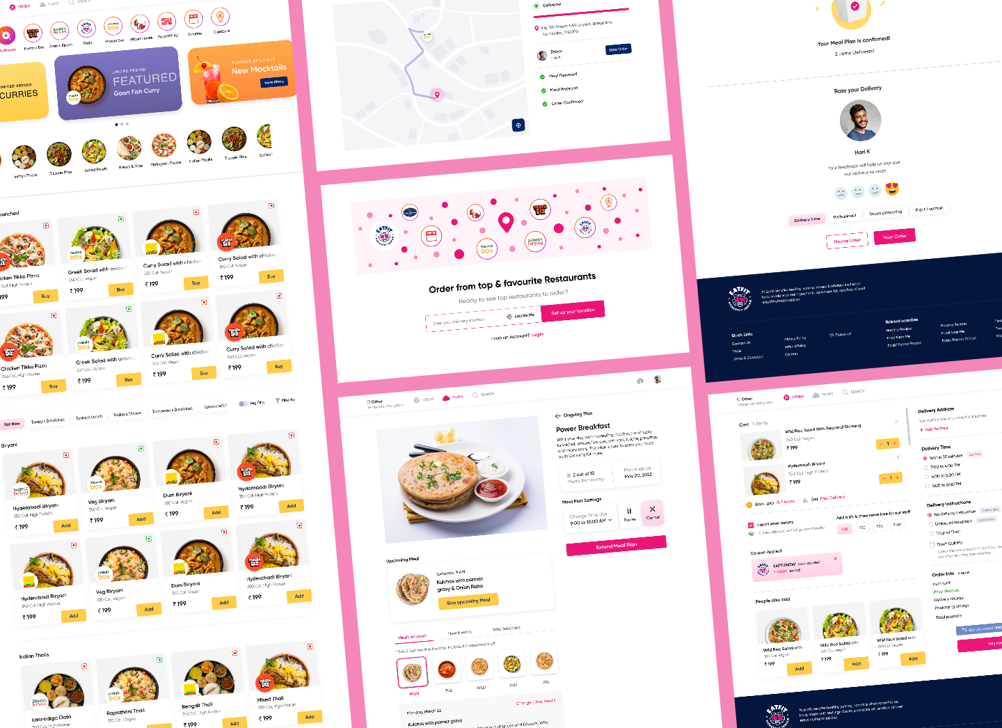
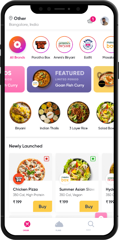
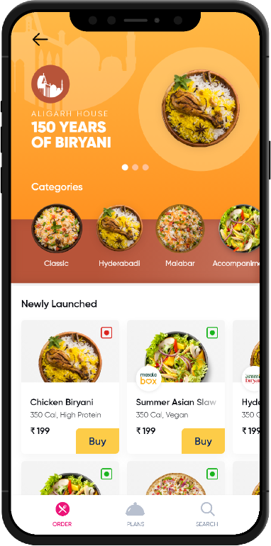
Eatfit delivers fresh, tasty meals that are wholesome but most importantly super healthy. Eatfit offers you not only a nutritious, preservative-free meal but also a variety of cuisines to choose from and menus that change regularly.
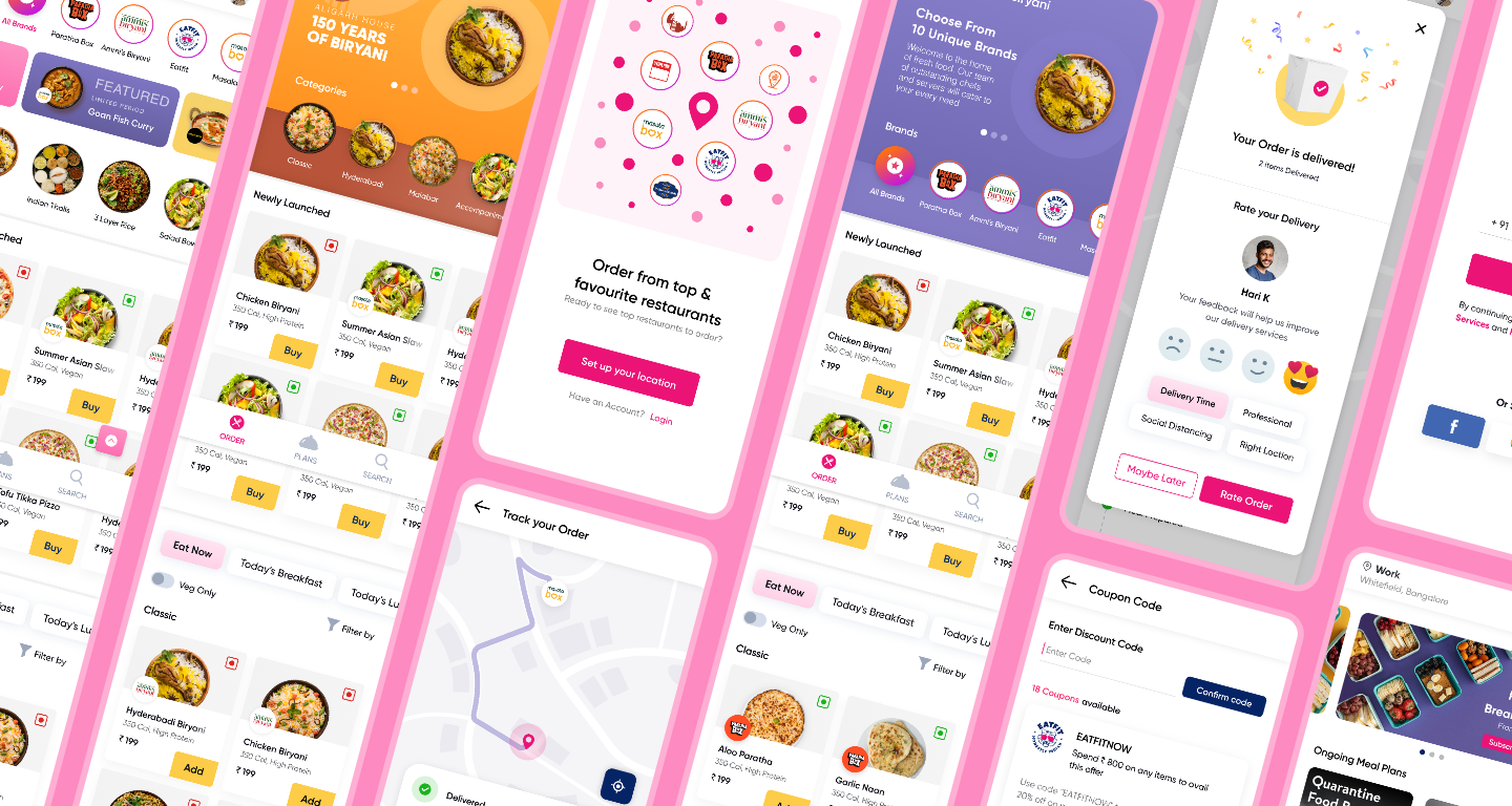
GoProtoz is an incredible team of true artists that create designs and experiences that people love and that drive marketing results. To me, GoProtoz is one of the top design agencies around today.

Rahul Shankar
CEO of Eat fit

Challenge
What Challenge have we encountered?
1
Understand the user pain point and revamp their online food ordering platform.
2
Reinvested our learning and resources to deliver a cost-effective solution.
3
Improve usability and the overall user experience of food delivery applications.
We created the user persona and defined the Design Problem. Overall project goals were also defined aligning with the aim. By creating correct user persona we define the goals and scope of the project.
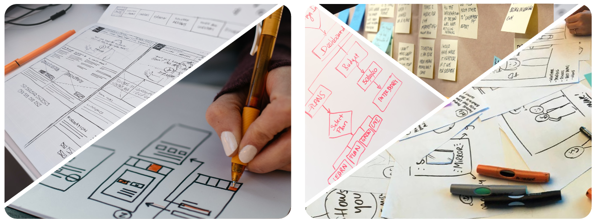
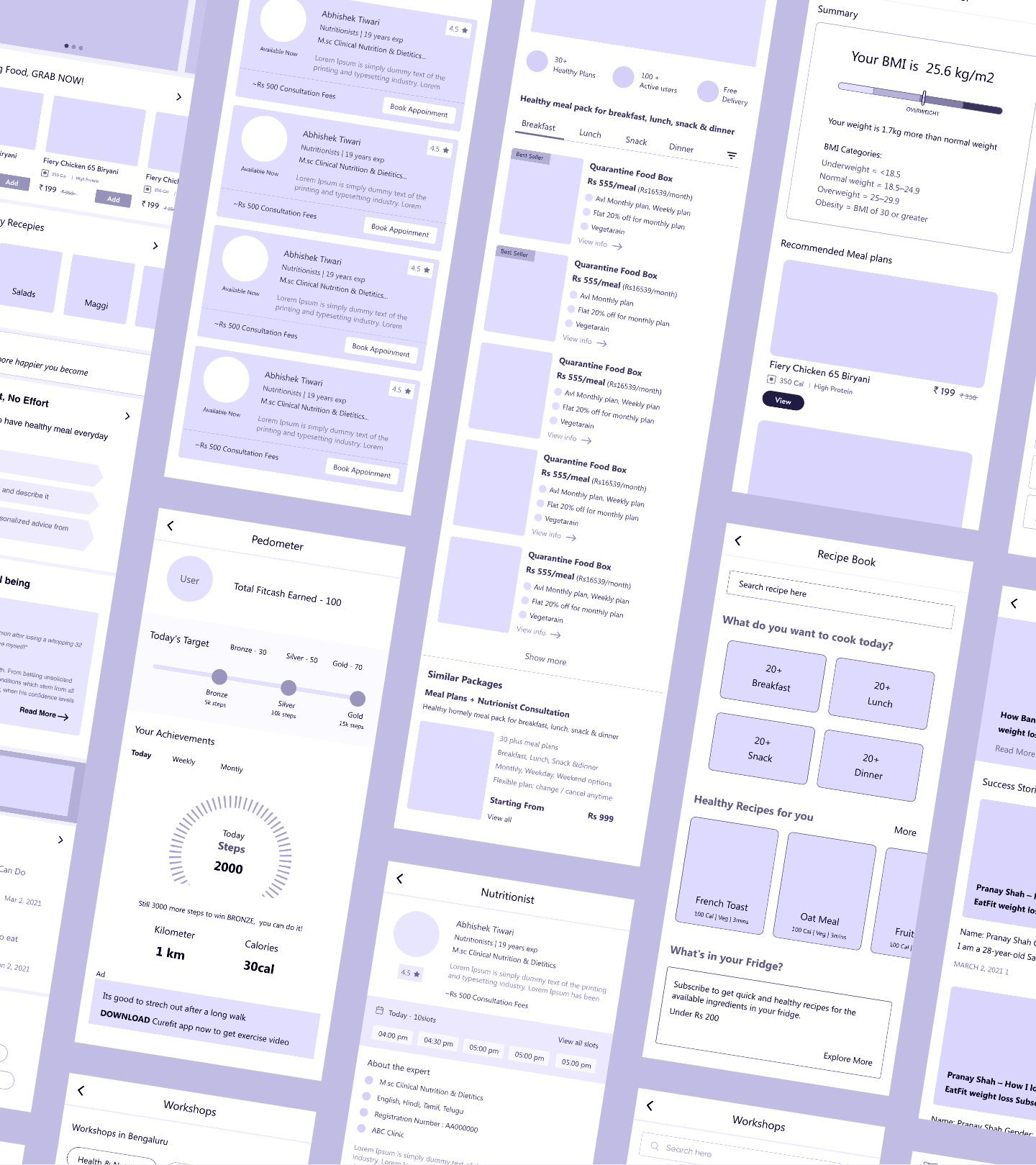
We create the project feature roadmap and then we make the information architecture (IA) and wireframes for the app.
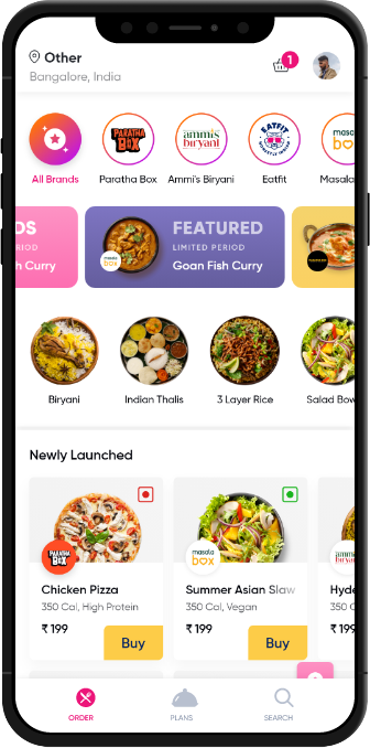
We proceeded with visual design to enhance the product’s creative appeal and usability. We designed the necessary features to generate an interface that improved user experience and is growth driven.
